
The 2022 season of the Indian Premier League is fast approaching, bringing along with it nearly two-months worth of entertainment and drama for all the fans assembled. And this year, with the expansion of the league to 10 teams, expect the usual hype and excitement around the tournament to be amplified to the next level.
Every season, the IPL throngs the different stadiums spread across the whole country, with delirious fans sporting the colors of their favorite franchises. And while this year that might not be quite possible; partly due to the restricted crowd attendances, partly due to the tournament being played in one singular state; the fans and flavor of the IPL will remain at its typical colorful best.
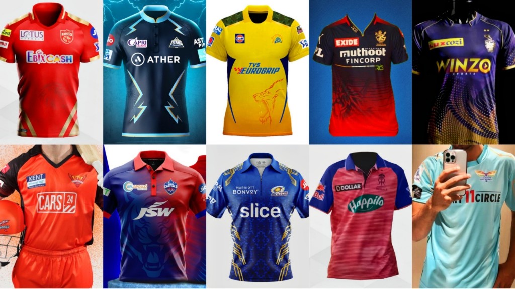
But out of all the different colors, which one is the best? That’s something we’ll try to discuss in today’s article, as we rate the jerseys of all the ten IPL teams from worst to best. This will be done on the basis of personal tastes and preferences, so there might be slight biases somewhere. But to make this discussion all the more fun, we encourage you to drop your personal ratings in the comments for your favorite jerseys.
10. Rajasthan Royals
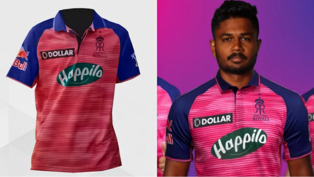
In recent times, the Rajasthan Royals have decided to endorse their local home base, Jaipur’s ‘Pink City’ flavor to a more prominent degree. So RR have gone with a pink-colored jersey with a decent mix of blue on the sides to give their kit a more unique and indigenous touch.
But their jersey this year looks like a mix of bright colorful bubblegum wrappers interspersed with sponsors- of which there are too many- which we’re not really a fan of. It’s a shame we’ve rated them last on this list because the Royals management did quite a grand reveal of their attire with a video featuring international stuntman, Robbie Maddinson.
9. Sunrisers Hyderabad
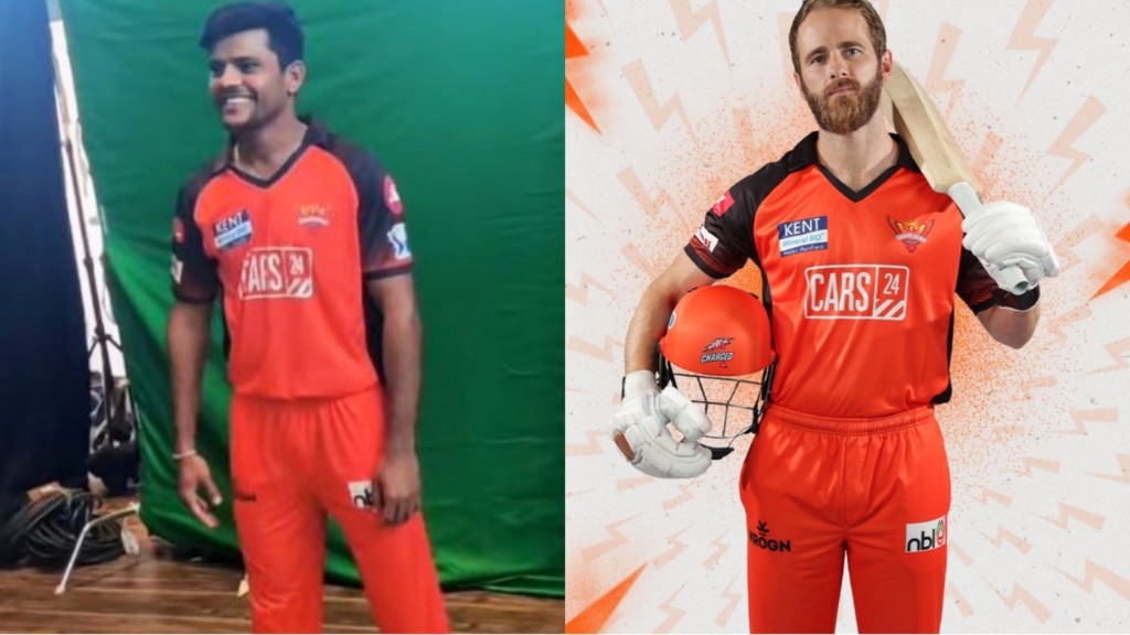
The Sunrisers are colloquially referred to as the ‘Orange Army’ by fans, thanks to the unique black-and-orange theme that has come to define their attire over the past few seasons. And while they haven’t made too many deviations from that personalised blend of colors, the SRH creative team sure seems to have gone with the motto of ‘Orange is the new black’.
Their trousers, which were previously black in color, now sport the same vibrant orange color that dominates the front of their shirts. Also, it seems like the management has ditched the awkward gold bands at the shoulder of the shirts, which is, admittedly, a welcome change. But once again; an uneven mix of sponsors and colors makes the jersey reminiscent of a petrol-pump employee uniform, which is certainly a big no-no as far as we’re concerned.
8. Punjab Kings
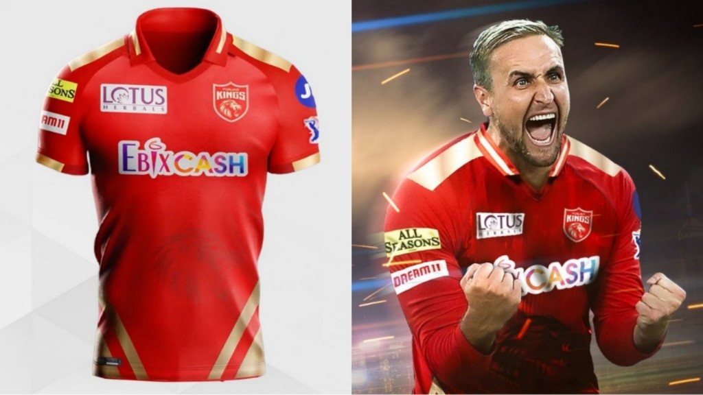
We’ll try to keep this one short, because out of all the new jerseys, Punjab is the one that has made the least amount of changes. Which isn’t a bad thing by itself, but it certainly won’t help the #shersquad to shed their moniker of ‘RCB lite’.
Red and gold just seem too mainstream these days, given how many teams have already gone for the color(s). But the fact that the PBKS creative team hasn’t really implemented any changes in the design of the jersey- barring a few changes of sponsors- gives the impression that they are too much bothered about how the team looks on the field. And that certainly attracts some negative points.
7. Lucknow Super Giants
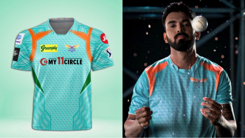
The Sanjiv Goenka-owned Lucknow Super Giants have assembled one of the most exciting and colorful-looking squads on paper. But it’s a bit ironic that the jersey they will be or at least seem to be sporting for their inaugural season will be a mix of a light blue-cyan-pastel green color.
Now admittedly, LSG has nailed it with the originality factor, especially considering the abundance of blue-themed jerseys in the IPL. The light pastel colors also offer a good nod to Lucknow’s state, Uttar Pradesh’s Chikankari style of embroidery. But they might want to increase the saturation of their jersey by a slight bit; because for all we know, wearing a light-color, almost semi-white jersey might just give some of their batters an excuse to play in test-match style.
6. Chennai Super Kings
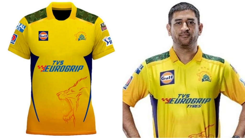
You cannot go much wrong with the tried and tested color that has won 4 championships, and it’s hardly a surprise that the Super Kings were not going to deviate away from that theme. Like Punjab, barring a few changes of sponsors, CSK haven’t really made any outrageous or novel modifications to their classic yellow attire.
In fact, just like last year, the 2022 edition of the Chennai jersey also features military camouflage-themed designs at the shoulders. Our only complaint is that CSK hasn’t really made any improvements on their 2021 jersey- but then the counter-argument would be, “If it ain’t broke, why fix it?”. So number 6 seems like a fair midway spot,
5. Mumbai Indians
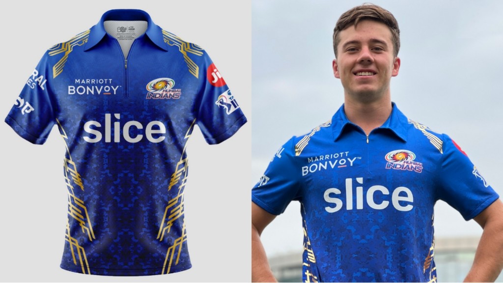
Mumbai Indians are among those teams who seem to have settled down on a consistent, fixed set of colors that they’ll keep sporting all through their lifespan. Which is not necessarily a bad thing; especially considering how iconic their blue and gold motif has come to be over the last few years.
ALSO READ: The Strongest Playing XI Mumbai Indians can field in IPL 2022
Mumbai have made a few minor tweaks in their kit this time around though; the most prominent one being the addition of gold colored ‘tech’ designs around the shoulders and lower abdomen. There’s also a nice camo pattern on the shirt that adds more richness to the iconic blue color. All-in-all, a very appropriate jersey to mark the beginning of a rebooted new cycle for the five-time champions.
4. Delhi Capitals

While Delhi’s performances over the past few seasons were very impressive, one thing that a lot of their fans didn’t like was them going ahead with the massively overdone blue color in their jersey. Granted, there were a few splashes of red here and there, but it did seem a bit repetitive considering the number of teams with blue kits in the IPL.
This time around, however, they have rectified on that issue by adding substantially more red to the left side of their jersey, giving a nice blend of colors to the shirt. It’s still predominantly a blue-colored jersey, but the increase in red color also serves as a good easter egg to their erstwhile Delhi Daredevils kits, which is quite interesting.
3. Kolkata Knight Riders

Ever since the KKR made the switch to purple from black a long time back, the team has been going through a bit of a purple patch. So its hardly a surprise that they were gonna stay consistent with that theme.
The Kolkata kit this year retains that shade of purple, although perhaps on a slightly oversaturated scale. The gold lines that were previously scattered on the lower part of the shirt are now replaced by a fiery logo that’s been made out of small gold and purple dots. The only thing we’d have liked is for the jersey to have collars, but overall, it’s a very solid jersey with some very vibrant colors.
2. Gujarat Titans
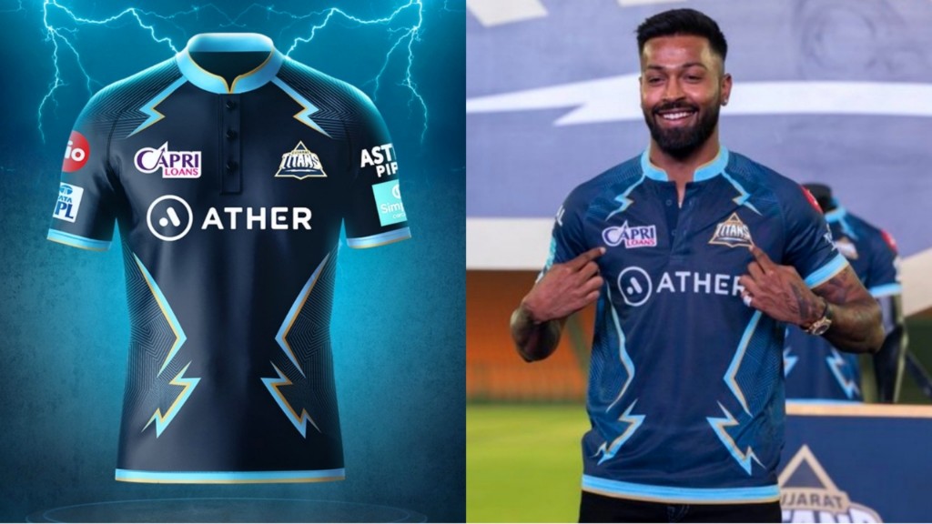
Heading into the IPL 2022, the Titans have quite a few question marks around the pedigree of their batting order. But the one thing almost every IPL fan has unanimously agreed on is that the Titans’ kit is one of the cleanest and suave jerseys going around this year.
The Titans creative team really seems to have nailed down their simplistic albeit impressive design to near perfection. While primarily dark blue in color, the shirt features bolts of cyan lightning running along the sides of the chest and abdomen, which really does a bit of energy to anyone who looks at it. Complemented brilliantly with a bold golden font that features the player’s name in the backside, the Gujarat jersey really does scream their mantra of “Aava De!” out loud.
1. Royal Challengers Bangalore
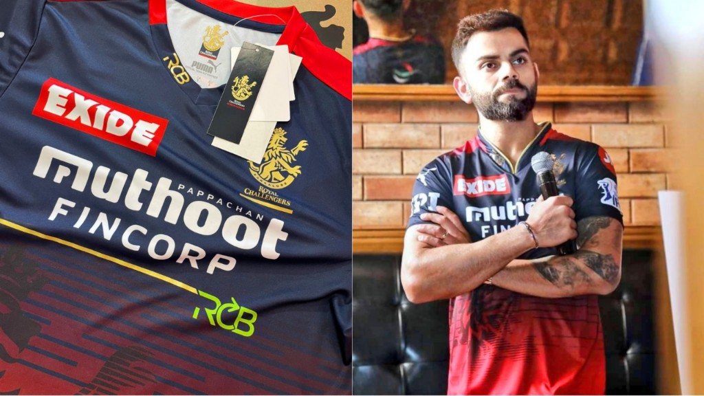
As one of the most iconic teams of the tournament, RCB already had quite a sleek-looking jersey leading upto this edition of the IPL. The RCB jersey 2022, however, goes a step further in taking that sleekness to next level smooth, which makes their jersey- in our opinion- the best one of this year.
Rather than compartmentalizing the red and black colors, RCB have opted for a nice top-to-bottom blend of colors this year, which gives the lion at the front of their jersey an even bolder appearance. Perfect to go along with their #playbold motto, right? There’s also a nice collar-like design which- again- just blends really smoothly with the shirt. The arrowhead caption of the team name at the bottom of the sponsor’s logo is also a nice addition.
ALSO READ: The Strongest Playing XI Which RCB Can Field in IPL 2022
RCB have always been the most laborious of the teams in terms of designing their jerseys- what with their multiple iterations of home-and-away kits and special colored kits to celebrate iconic games. It’s only fair that their creative think tank walks away with the award of the best jersey for this year, and we’re really excited to see them wear their different colored blue/ green jersey this season.